#Instabetter: Custom Settings = Creative Control
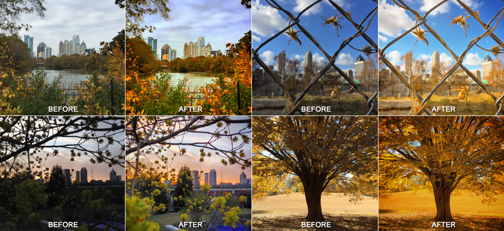
Ok, now that your Part 1 has you taking better quality images with your smart phone, let’s get right down to it. Post-processing is the second best tool in your bag for expressing your unique point of view thru your images. Now I have over 20 years of Photoshop experience, plus a painting & illustration background that pre-dates some of you guys’ entire existence, but I’m gonna break it all down for you right now, using nothing more than what’s already available to you in Instagram. I use the “Custom Settings” menu exclusively when posting smartphone images, and I do in fact have a formula that I tend to follow. Basically, those 20+ years of Photoshop experience I mentioned, combined with an in-depth knowledge and understanding of light, shadow and how colors render (both in pixels and on paper), can all be boiled down to about 5 or 6 subtle but very critical adjustments. And wouldn’t you know it, they are all at your finger tips, if you know which direction to swipe that slippery slider.
First: The order is chaos.
The #1 critical step here is NOT to follow the order in which the custom settings are presented to you in the Instagram settings menu. If you do, you might get mediocre results, but you will not fully achieve the best edit possible for your image. Dear Instagram, if you’re reading this, please fix. Mmmkay, thanks!
Now: Kill those shady shadows.
You probably think that because your overall image is dark, that the first thing you should do is increase the brightness (apparently Instagram thinks so too) but this is not true at all. I can tell you with unwavering certainty that the most important step, before you touch anything else, is to REMOVE BLACK from your overall image using the “Shadows” slider! This is annoyingly placed pretty far to the right/center of the slider menu, forcing you to scroll right to even find it, but it’s the absolute critical first step. Slide to the right (maybe about halfway) and watch the details of your image come to life and jump off the screen (you’re welcome). Black is extremely bossy, in digital or print, and even a small amount of black can take over your image. Get rid of it, and don’t worry if your image flattens out a little bit, there are other settings we’ll use later to counter that. Trust me, slide right about halfway, or maybe even more for very dark images.
NOTE: If you’re feeling a little muted and grayed out and you just can’t stand it, scoot back over to the left and boost “Contrast” (slide right) to put back some of that black in the darkest points. But also know that you will be affecting highlights & color intensity, so be conservative for now (maybe slide about 1/3 or less to the right for now).
Next: Show brightness who’s boss.
Since smart phone cameras tend to blow out highlights (HDR effect helps mitigate this a little), in most cases I recommend lowering the “Brightness” (slide left). Use your judgment, as every image will be slightly different, but for a proper exposure, sliding brightness about halfway to the left, and sometimes more, is usually a comfortable place to be. Now that you’ve pulled your overall brightness back, the image should start looking richer, but still a little one-dimensional. The key here is to shoot way back over the right (annoying, I know) in the custom setting menu and find “Highlights” and boost those to your liking. I generally boost highlights about 50–100%, but it depends on the exposure. Now your image should really be popping, but we’re not done yet.
Then: Adjust color temperature (warmth) & saturation
I tend to favor warmer tones with about medium–high saturation, but sometimes the mood and natural color palette of the subject demands a cooler and/or softer approach. The key is knowing which is most suited to the scene and the overall emotional connection you’re trying to convey through the image. Color invokes feeling, and thru the proper use of temperature (white balance) and saturation, you can influence that emotional connection. Start first by adjusting the “Warmth” to your liking (slide right for warmer tones or left for a cooler approach). Then you can increase (or decrease) saturation until you get the desired ambient look that you’re going for. Now is also a good time to revisit “Contrast” and see if you need to increase or back off a little, as “Saturation” will certainly clash with “Contrast” in very colorful images. In general, grays & neutral tones can tolerate heavy contrast & saturation, where bright, vivid colors won’t need as much (if any at all).
Finally: You Can Get Focused
The last thing you want do is add some “Sharpening” (in most cases) to really make the edges & small details pop. Don’t go crazy though, or your image will look too crispy. I usually shoot for 25%–50% sharpening. You also have the option to isolate focus using a linear or radial blur feature called “Tilt Shift“. Use your fingers to resize/rotate/manipulate the blur to your liking, but use this sparingly. It’s a little gimmicky and 9 times out of 10, it doesn’t really look that great (there’s a reason tilt shift lenses are so expensive). I find it works best on images with a limited depth of field, that already have some blur present. If you add this to an average image (on a flat plane), it just looks really phony. Finish up drawing focus by adding some “Vignetting” around the edges if you want, but be conservative here as well. Darkening the edges of your image will help close in the focal point and draw more attention to the center, but depending on the image, if you push it too far it this can look a little muddy. There are many times I never even touch Tilt Shift or Vignette, as they are not necessary, just subtle enhancements that should be used with restraint.
Now that you’ve covered all your bases, hopefully your newly edited image is starting to look pretty awesome. If it’s not quite awesome enough though, I do have one more little trick to share — and hang onto your hat because it’s a good one!
Bonus: One more Thing!
If you have actually made it this far in reading my long-winded ramblings, you certainly deserve to know how I get that extra sizzle. It’s a little trick best described as double-processing, which is widely known and practiced in professional editing (especially in HDR). Of course, Instagram is no substitute for Lightroom, Photoshop, Photomatix, etc. (just like my iPhone 6 Plus JPEGS are no match for a DSLR camera RAW image), but all things considered, this technique can produce quite wonderful and impressive results. I simply screen grab my edited image, and reload the screen grab thru Instagram and continue editing. I make tweaks most often to get even more black out of the Shadows, more brightness in the Highlights (not overall brightness) and sometimes Warming (or cooling) the temperature even more.
I created my own version of what I believe the order should be. Of course I had to throw my own extra special sauce in there at the end, just for kicks. 🙂 Hey, a girl can dream, right?
So that’s it, now you know all my Instagram tricks. If you liked this article, or if you have some tips of your own you want to share, please let me know below or holler at me (graphiknation) on Instagram, Flickr or Twitter. Or if you’re ever in the mood (and in the ATL) come shoot with me and the Atlanta Urban Photo Walkers sometime!
GEAR:
I currently have an Apple iPhone 6 Plus, and in the past I have had iPhones 3, 4 & 5, all of which have shown up on my Instagram feed. When I shoot professional I use Mirrorless/Micro Four Thirds format. I own a Panasonic Lumix G3, an Olympus Pen EP5, and I more recently purchased an even smaller Panasonic Lumix GM1, for times when I want to go really light weight. I have about 7 high quality micro 4/3 lenses, mostly Lumix/Panasonic brand, and one Olympus brand. I edit professionally in Adobe Lightroom & Adobe Photoshop. Some of my professional images show up in my Instagram feed, but many more of them can be seen on Flickr.