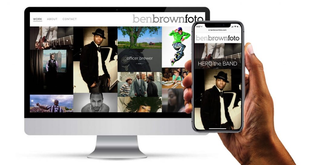
Branding
logo, business cards & website design
I have known and collaborated with Ben many times over the years, and my inspiration for his logo came from his strong, insightful and introspective personality and point of view. For Ben’s logo, I wanted to create a bold, typographic design that did not have spaces between the words. I wanted the words to only be separated visually by a subtle change in color, from light gray, to medium gray and then black. I wanted it to be simple, clean and classic, allowing the imagery to be the real focal point.


